Frank Chimero: Influencing Design
Blog zero: This is an unfinished draft that I am posting. The notes below are rough. Please enjoy them as they are.
I was lucky enough to hear Frank Chimero talk at ACMI. Frank’s a fantastic designer and visual artist with a long history of teaching and blogging about design. Of late, he’s stepped back from active designing to explore what it is to have excellent design and what truly drives good design (and the designers who make those things). His talk discussed his new book which is the culmination of what he calls his journey and what he discovers in that process.
Hi, Melbourne
I bought the book as part of the talk, and it’s now available online, which was originally funded by a successful Kickstarter. At a later stage, I’ll jot down my thoughts on Frank’s book.
Here's my notes on Frank's talk:
The things in this world affect use and we affect them.
The more you say, the less you say.
Frank makes pictures about words, and words about pictures.
Epic views inspire great thoughts.
The search is what anyone would undertake if he was not sure.
The tiny horse in Apple store story - obvious things that have become commonplace, to the point that a tiny horse can be in the Apple store and no-one notices (or cares)!
The good thing about students is that they ask why.
- You might trust your gut or your experience. But why do you trust that? How was it developed?
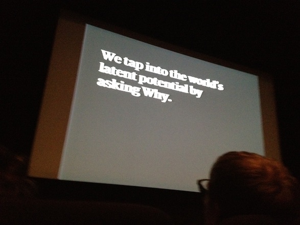
Tap into the world's latent potential by asking why.
Some levels of craft to think of:
- beauty
- aesthetics
- ugliness
- alienation
Design should be inclusive, for everyone - beauty can be exclusive.
Dieter Rams' list of good design ideals - they're good but you end up designing like Dieter! You're talking to the same people that Dieter was.
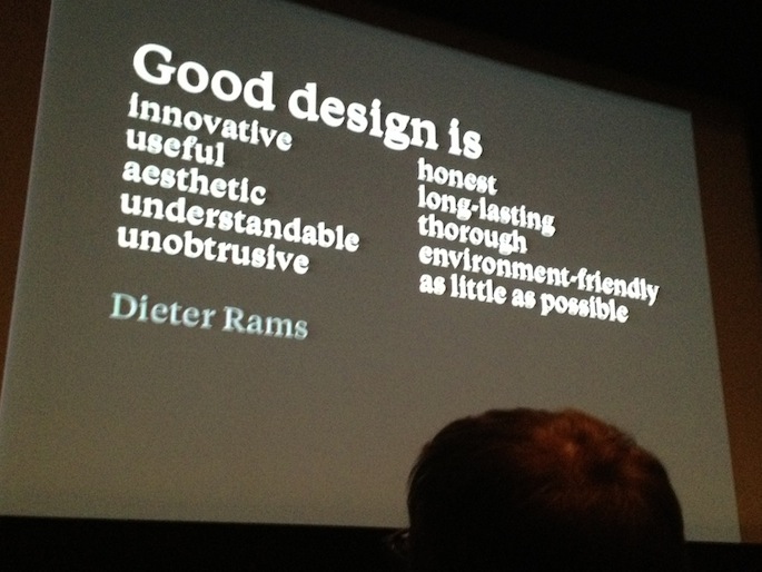
Dieter Ram's design ideals
Good design can be:
- weird
- kitsch
- humourous
- complex
Good design is benevolent - it benefits the person who commissions it, who makes it, who uses it and the world that results from it.
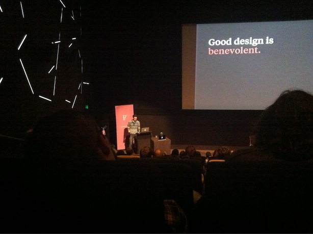
Good design is benevolent
Design is the choice about the world we want to live in. - Miller(?)
Design is like writing:
- everyone should know it, everyone should do it
- but only certain people should be professionals
We design things to help us live well. That's it.
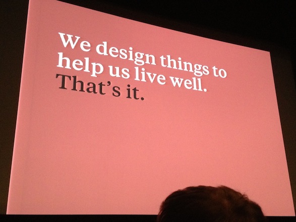
We design things to help us live well.
There are designs...
- that you lust for, eg. the Eames Chair
- that changed the world, eg. the Apple Classic
- that you use everyday, eg. Google
- that are gateways to things Frank loves, eg. physical records are a gateway to the music itself
- that are so simple that they don't seem like they were designed, eg. the paperclip
- that build other designs, eg. LEGO
![]()
![]()
Iconic designs.
Good design moves.
- We move in our processes as we (as designers) make the work.
- The audience moves as the work stirs emotions or enables us.
- The work itself moves out and around as it is shared.
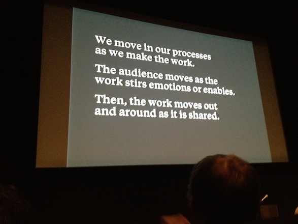
Good design moves.
Frank's process is shifting between Near and Far states:
- Near is close-in, doing work. It is about asking the question How?
- Far is to stand back and reflect. It is about ask the question Why?
If you map How (Making, Execution, Craft) and Why (Thinking, Strategy, Analysis), the overlap is Design.
Ask why to define objectives of the work - it gives you guidance of direction.
If I asked the customer what they wanted, they would have said a faster horse.
-- Henry Ford
If you only ask How questions ("How can we make a faster horse"), you would have ended up with a horse with a jetpack. If you ask Why questions ("Why do you need a faster horse"), you could end up with a car.
Now that the work has a destination...
- experiment
- improvise
- wonder
- or, Flail around like an idiot
To improvise well, establish your underlying framework and then say "Yes, and..."
- Yes: incorporate and accept the limitations of the framework you have
- and...
- build on it
Just like writing drunk, editing sober:
- Create a framework
- Accept and build off the framework
Things to consider:
- Content - message, utility, reason it exists
- Tone - design, not what but how it's said
- Format - the final form, eg. a website, a poster, etc
Lots of campaigns will have:
- similar content
- change to the format, eg. different ideas for Facebook, paper, TV
Content is the Why.
Format is the How.
Think of Content, Tone and Format as levers on a machine. Play with the settings.
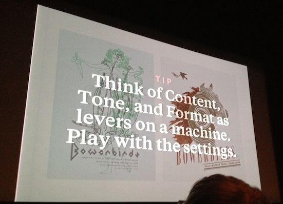
Design levers.
Good content trumps everything. Garbage in, garbage out. If there's bad content, fix it.
Question convention - fresh configurations feel like magic.
You don't get to the iPhone by iterating on what makes a phone good, you design to find the things that make the phone everywhere (ubiquity). Use How to respond to the need that makes the phone necessary.
Magic, once made, seems obvious.
The best magic trick: showing you what was always there.
We try to do things the right way and that usually means doing things the long, hard, stupid way. This creates an efficiency gap. Outwardly, the design shows care, craft, delight. But inside, there's blood, sweat, toil.
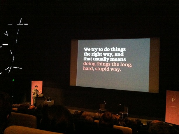
We try to do things the right way, and that usually means doing things the long, hard, stupid way.
Work's motion is a gift. We can be touched and influenced by others. Remember to share your decisions back.
There is value outside of money. The care that went into producing it is worth rejoicing over.
We share the products of design like they were a gift. The idea of the success of a gift suits the notion of the success of products of design.
We share the products of design like they were a gift.
The further a product moves, the more value it has. A family heirloom has moved from generation to generation.
Great design moves people to carry it to share it with others. It builds and satisfies desire.
Great design moves because other people carry it.
Design can not only create desire, but also satiate it.
Everything was made. Everything can be remade.
Some things need to be made quickly to get it out into a feedback loop. Some things are pushed out once and they're done. Either way, you need to step back at some point and celebrate the work.